Task 2: Professional Practice

Group Showcase Project…

As a team you are to design a showcase interface which will then incorporate all of your team member’s portfolio sites. The interface must contain a simple logo to represent your team and links to all your team members’ portfolios. The showcase interface must have a theme, possibly based on Brighton and/or City College and may contain animation and sound.

The Group Showcase is complete and the finished site MISFITS 5 can be found here=> http://panaramadan.com/ for a limited time.

The development of the site can be found here=> http://themightymisfits.wordpress.com/ at the team’s blog.

Mobile Site Attempt…

Creating a Mobile Site using JQuery…

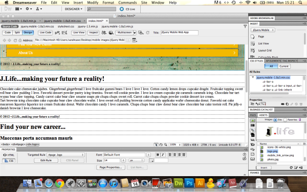
I used a template to start the test workshop page and these are the results…

Above, you can see that I have successfully installed my header graphic for the page.  In order to get this to fit the space available I had to resize it in Fireworks.

Above, I have swapped in my own back ground, the same as the original site, and edited the nab. bars so that they relate to my content.

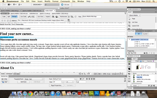
Here I have edited the H2 tags and added my own cupcake-ipsum…

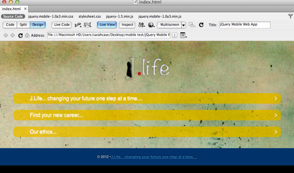
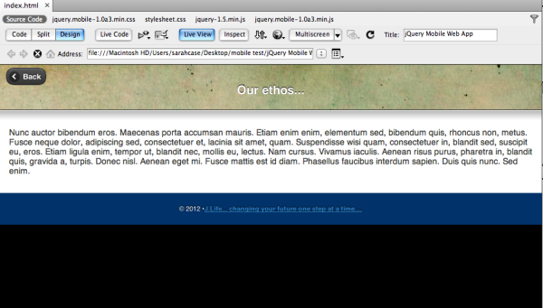
Live View (as seen in browser)…

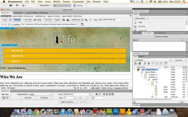
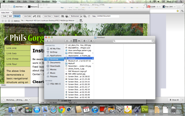
Below, the root menu that shows where the image files are stored on my mac.  This is important because whilst using dream weaver I had to remember not to move any of these folders around, otherwise the site would stop working whilst under construction.

As with the rest of web design, I know I still have a lot to learn but at least this has been a start to exploring the possibilities of the mobile web.

My Web 2.0 Site – Design & Ideas…

The Creation Of A Social Media 2.0 Type Website…

At the start of this project I had to decide whether I was going to use wordpress or rapid weaver to create my next website.  After the difficult experience of using dreamweaver I wanted to be able to use a programme that would enable me to deal with designing a site without needing to use a lot of code.  So, I made the decision to use rapid weaver, as I have a mac and could see myself using the programme to design other sites in the future.  Although I was pleased with the programme and the decision, this meant that I would have to learn a new programme again from scratch.

I had various ideas of what sort of website I wanted to create, ranging from fun and frivolous to the practical and purposeful.  One being a site where you could post pictures of yourself wearing  all sorts of different hats with the possibility of swapping hats.  Another, a theatre and arts site where you would be able to make friends, post stories and reviews; and chiefly be able to swap memorabilia.

Finally, I decided to use an idea that would have a practical purpose, a job site that had social media features and the ability to create a job search blog.  This could either be used by Job Centre Plus or just used as an individual record of your search for work.  The site would also connect people to all sorts of careers services, such as CV writing, psychometric testing – http://en.wikipedia.org/wiki/Psychometrics – and training.

As I previously mentioned, being a new user of rapid weaver it would take me a few false starts to get used to the programme and come up with a design I was happy with.  This is why, as you will see, there are a couple of different designs.  I wanted to be able to create the design from scratch, to do this I needed to buy ‘Blocks’, it’s theme and various other plugins for rapid weaver.  Although I enjoyed working with rapid weaver and found it easier to use than dreamweaver, I still have a lot to learn to enable me to create sites quickly and easily.  This is where online tutorials became very useful – http://www.rapidweaverclassroom.com/ – http://www.realmacsoftware.com/support/

As above this is the button to click to access the themes…

This is the theme I have used, which is a modified copy of the blocks theme.  This allows you to make the desired changes to the theme, like graphics, headers and footers.

Creating The Site…

Making the Header –

I chose this image as a starting point because it is the view of a road where you can see a long way into the distance.  A metaphor for being able to look into the future – to find a new career.

I took this image into Illustrator and made a trace of it, muting the colours and creating a logo.

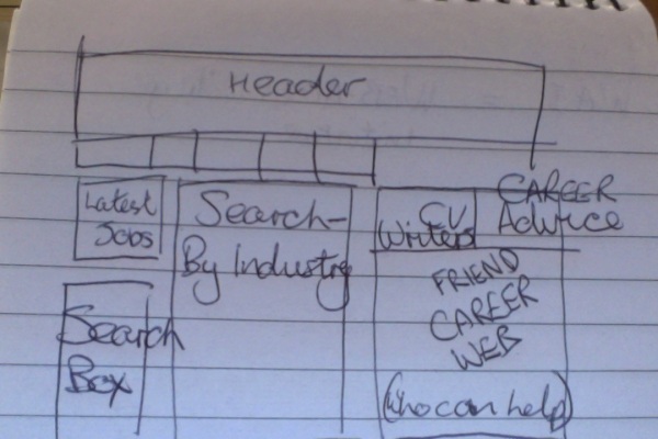
Mocking up the layout –

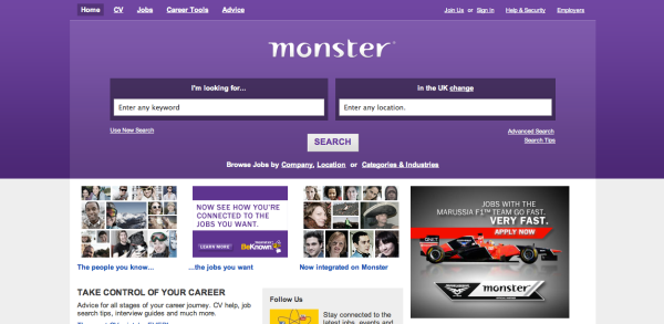
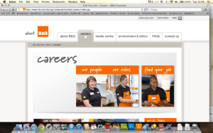
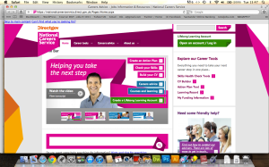
Examples (below) of other successful websites, their features and layout –

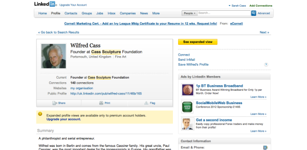
Below is a screen shot of the website LinkedIn –

This site has many of the features I was aiming for, although I would have liked my site to offer a more individual service.  What I mean by this, is that each user who signed up would have the option to pay a subscription fee to access a personal advisor that would actively seek work on their behalf.

Creating the site in Rapid Weaver –

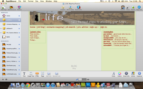
I wanted the site to contain a blog page, a job search page, a contacts mapping page and a page where users could ask for professional careers advice.

This design above is my first attempt at using rapid weaver, I later discovered that the sizing of the site was wrong and that I had made some errors which would have taken a long time to correct.

Below, the blog page in both views…

The Final site –

The Final Site shown in the browser…

Each image is linked to its career specific website and all the navigation works and links all the pages together.

These are the ‘top employer’ site links that I have listed on the page…

Here are a couple of examples of the clickable tabs/images and their links on the home page…

CV Writing –


Job Centre Search –

The other pages on the site viewed in Rapid Weaver…

I would have liked to include clickable adverts on each of these subsequent pages.  Also the job search function of the site is just a simple contact form which works, but not how the actual site should function.  This is because I do not have the skills to programme this type of search engine and the site is not linked to, therefore doesn’t contain, any actual jobs or job information…

Job Blog…

Contact Mapping…

This is a link which will take the user to an external site, which works well but does not function the way I originally wanted it to.  I would have liked to have been able to create/programme an application that enabled the user to map all their contacts, so that they could visually see how each one was linked.  This would enable the users to network with new people which could lead to new employment or furthering of their career.

Professional Advice…

Job Search…

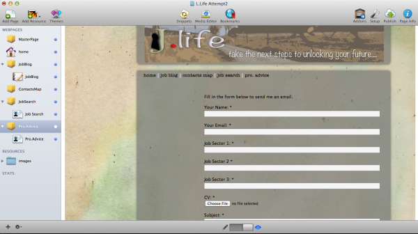
I had problems with this page as it doesn’t appear to have been linked together correctly.  This means that unfortunately the ‘contact form’ is not shown overlaid onto the blocks page.


Conclusions about the site: –

I know that in the future I will be using rapid weaver to create web sites which will exceed the functionality of this attempt.  It has been a steep learning curve for me to get to grips with this programme, even though its format is a far simpler drag and drop one to that of dream weaver.  My next attempt will include the use of a theme which will save me time and frustration.  I am still not totally at ease with the FTP upload process and managing/accessing my c-pannel.  However this will change and the next attempt at a site will be a lot easier.

To see how the site functions in the browser click this link – www.scasewebs.co.uk

Task 1 Research and analyse ONE of the following topics: A) The Web 2.0 Phenomenon B) Mobile technologies and the web

A) The Web 2.0 Phenomenon WhatisWeb2.0?:Lookatanddescribeinaminimumof 500 words an illustrated account of the design and technical properties of Web 2.0. A great source of Web 2.0 design and sites at: http://www.go2web20.net Choose one Web2.0 site and describe its appearance and functionality; ie. its online identity. Examples of Web 2.0 sites include; flickr.com, imthere.com, read.io, swik.net, duckfarm.net, tutorialblog.org, revision3.com

WhatisWeb2.0?

As described here http://en.wikipedia.org/wiki/Web_2.0   and here http://oreilly.com/web2/archive/what-is-web-20.html Web 2 is an area of web design which is becoming increasingly more popular, as big business realises the complete power that social media has over their possible customer base.  Web 2 is a concept that  endorses user driven, easily navigable design.  As many designers will say, it is all about keeping the user within your site by providing interesting, helpful content and links which interact well with all the other social media, adding to the user’s digital comunication life. Web 2 promotes the idea of user participation and looks towards a world where that interaction is what will make up the majority of web content.  These ideas will allow the progression of the ‘cloud’ to become the norm; for example most social sites allow the user to store their own data and mixed media there, making the idea of personal, physical computer storage increasingly a thing of the past.

This image (above) illustrates how all computers in the future will use the ‘the cloud’ for storage and to access programmes and applications.

Whilst this image (above) shows the physical storage or hosting servers required to continue with the web 2 revolution of computing, communication and the internet.

I found this You Tube video very helpful http://www.youtube.com/watch?v=0LzQIUANnHc

The video spoke about the users experience and how the web is becoming more and more user centred.  What is meant by this, is that  web designers are increasingly striving to create an environment where the user feels at home in an area that feels as familiar as the desk top.  The desk top format is easily recognisable and immediately navigable to any user.  This format allows the user to drag and drop files and store them in as many ways as they could ever require, something that web 2.0 is aiming to increase in the future.

The Buzz Words of Web 2.0…

Blogging –

http://www.youtube.com/watch?v=NN2I1pWXjXI&feature=endscreen&NR=1

http://www.youtube.com/watch?v=FgJTxmdynX0&feature=endscreen&NR=1

Writing online in a journal type way .i.e. a travel log with text, video and images – A recipe and food blog – OR – A blog about you and your every day life.  Blogging is a way of advertising yourself and what you do, which can be linked to any other social media site you belong to.  This increases the amount of followers of your blog, therefore increasing the promotion of yourself as an individual or as a business.

Mashups –

http://en.wikipedia.org/wiki/Mashup_(web_application_hybrid) http://www.youtube.com/watch?v=U9sENSA_sjI  –

This refers to the combined use of different API’s (Application Programme Interfaces – Apps people interact with) to create new and exciting applications.  What is meant by this is, if your site requires a map of up and coming music venues and their events, then you would mash up a diary listing with Google maps to create a new app giving the user the exact information in one go rather than having to use the two different apps independently of each other. This is a lot easier than writing/programming an app from scratch,   it also allows anyone free reign to create new mash-ups online without seeking any permission as would be needed when adding anything to a desktop operating system.

Ajax –

http://en.wikipedia.org/wiki/Ajax_(programming)This term has come to represent a broad range of technologies which enable the web to continually keep running whilst being able to connect to the server in the background.

RIA –

http://en.wikipedia.org/wiki/Rich_Internet_application http://www.jamesward.com/2007/10/17/what-is-a-rich-internet-application/This RIA – Rich Internet Application – is best described by saying that its main aim is to create a web where the users experience is enhanced by the amount of control they have over their own internet environment.  This is created by using plugins which enable the use to taylor their experience – i.e. adding a RSS feed or linking to Facebook.

Flash –

This is an adobe application which is used for animation and video but is soon to be out moded by the introduction of their new Edge application which will rely more on html5, making the programme more open access (less restrictive) to all its users.

SOA –

This implies that everything is interlinked, from the server to the application making things quicker and more efficient.

Feeds & RSS –

http://www.youtube.com/watch?v=0klgLsSxGsU

This requires a user to subscribe to content from their favourite web sites, making it easier for them to access this content as it is delivered to them, rather than them having to search for it individually which wastes time.

Social Media –

http://www.youtube.com/watch?v=MpIOClX1jPE&feature=endscreen&NR=1

Allows the whole world to interact comment and rate content – with sites such as Flickr, Facebook, vimeo, you tube and twitter.

Tagging –

http://www.practicalecommerce.com/articles/589-What-Are-Tags-And-What-Is-Tagging-

http://www.youtube.com/watch?v=O50GXw11748

Adding comment or tagging yourself into another persons content.

Wiki –

This pertains to users adding their own content to wikipedia – adding correct information about a particular topic.  This content could then be linked to other sites.

Podcast –

http://en.wikipedia.org/wiki/Podcast

This is a series of sequentially uploaded files which have been recorded for users to access.  An example of this is the podcast that radio one makes of their breakfast show best bits every day – this is then made available for any users to download for as long as the file remains available on the BBC server.

To conclude, web 2.0  aims to provide a user friendly environment which gives easily navigable content that be interacted with, commented on, shared and rated by the rest of the world.

The future internet –  Web 3.0 is on its way!…

http://www.youtube.com/watch?NR=1&feature=endscreen&v=off08As3siM

B) Mobile technologies and the web Mobile websites(Note:NOTmobileApps)have become more popular over the last couple of years. Describe at least 2 platforms for creating a mobile website eg online or through frameworks like jQuery Mobile and what usability and design considerations should be taken into account when designing websites for mobile. Research and analyse at least one mobile website and describe how it differs from its usual browser formatted version eg. Flickr mobile.

Platforms for creating a mobile website  –

Articles and website I found:

http://mobile.smashingmagazine.com/2010/11/03/how-to-build-a-mobile-website/

http://mashable.com/2010/12/16/create-mobile-site-tools/

http://www.webpagefx.com/design-build-mobile-web-site.html

http://woorkup.com/2010/01/10/best-practices-to-develop-perfect-websites-for-iphone-and-mobile-devices/

http://en.wikipedia.org/wiki/Mobile_Web

How does the design differ from full screen internet to mobile internet? –

There are several important factors to take into consideration when creating a mobile version of a website.  They are as follows…

  • The site needs to be designed to allow for the use of gesture and touch technology.
  • It must be responsive – this means it includes some code that will allow the site to either resize to fit the device where it is being displayed or navigate to the mobile version of the site.
  • Best practice when designing for mobile is to make sure that this version is is stripped back to its simplest form, whilst keeping hold of all its functionality.  This makes the site simple to navigate and more likely to attract repeat visits, unlike those sites where the user has to repeatedly enlarge, shrink and scroll the access the entire page content.

Review of Facebook – the difference between mobile and web: –

Here is a shot of my Facebook page…

It is the full size site which has a lot of content available in one space –

this includes chat, apps, status and more.

Here (below) are some shots of my mobile showing the basic layout of the mobile site…

As above this (below) is the home part of the site shown here in both mobile and full views.

Above you can see this section of the site in mobile form, below is the site in its full form…

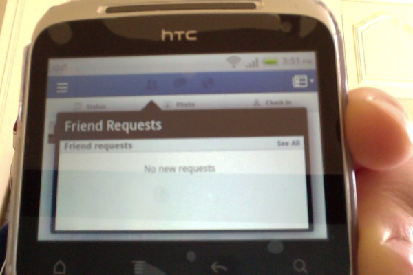
Above the mobile version of the friend request area of the site, below is the full version…

Above the shot of the mobile message area, below the view of the full site message area…

All of these images illustrate how mobile and full web pages differ in design.  In the mobile version of Facebook all of the functions have been simplified in their layout, most being given their dedicated page.  This is unlike the full web version where there are many functions and applications are available on one page.  The mobile version also incorporates easy upload of videos and images, as almost all phones have cameras these days, making it the quick way to publicise what you have been up to on the move.  Now you don’t need to wait until you can use your laptop to connect with Facebook friends!

THE FUTURE OF THE WEB… IS MOBILE….

Web Site Design & Production…

Task 3 – Production of a Website

Produce a series of 3 – 5 (max) interactive web pages to promote / advertise a particular event, product or occasion. These pages are to be as a minimum: 1) the homepage 2) an inside content page with text and images and 3) a contact/form page.

The design stage of this project started by looking at what sort of style I wanted the site to have, taking into consideration that the event I wanted to put on would be opulent, flamboyant and theatrical.  With this in mind I started searching for back ground images that would go well with this theme…
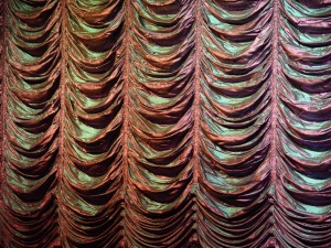
these pink ruched curtains were a bit too shiny to place content on top of….

However, these red curtains looked far more opulent and even included a gradient in the way they were lit, which gave texture to the background of my site without me having to add any in photoshop.

The next element was to design all the pages in photoshop…

The Header…

I needed to use a font in the style of cabaret…

I then added these png images of the AIDS ribbon to show the user immediately the exact point of the event.

Looking back at my ambitions for this site at the time, I now believe that they did over stretch my abilities and that I should have designed some thing simpler and more achievable for my first functioning website.

The Home/Index Page…
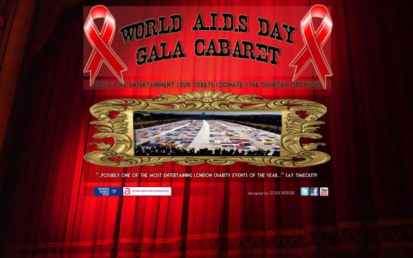
On this page I wanted to include a large hero image in a gilded frame that would scroll through a gallery of images like a slide show – instantly showing the user what the site was about.  The footer showing the charity logos is used on every page and shows clearly that this is a not for profit, charity event.

This is the site as seen in dreamweaver…

On every page the nav. bar was created using hot spots in dream weaver which link very page together making the site navigable.

This is how it turned out in the browser when designed with Dreamweaver….

I placed all of the imagery into the ap divs on the page and was pleased with the result in Dreamweaver preview, but when it came to viewing it in any browser the page would not stay in alinement.  This problem could be due to the fact that I inserted and deleted a lot of code from the site trying to create a scrolling slide like image show, which was unsuccessful and lead to me being resigned to using just one still image.

Here are the images (edited in photoshop to be the same size)I planned to use in the scrolling slide show/ hero imagery…

The following two images are of the venue where the event would have taken place, giving the viewer a taste of what to expect further into the site and on arrival on the day.

The Entertainment Gallery…

This page was to show all of the cabaret acts for the evening.  I placed each image on the same sized background which gave the page continuity of design in a symmetrical layout.  The aim was for each image to have a functioning roll-over with an enlarged image and information for each picture – this, in turn, could then even be linked to that performer’s video or web content.

An example on which I found here http://host.sonspring.com/hoverbox/ when reading this article here http://sonspring.com/journal/hoverbox-image-gallery

I even, if over ambitiously, found some video imagery to link to my site…

http://www.youtube.com/watch?v=j9RkCWjvNuA

http://www.youtube.com/watch?v=-D0rp-jI1g4

http://www.youtube.com/watch?v=st1_2AIEfI8

This is how the site looked in dreamweaver preview…

This is how the site looked through the browser when I designed it with dreamweaver…

 none of the thumbnail images showed up on the page, although they were mysteriously clickable and my ‘pop up’ images became visible each time.

When thinking of what acts I would like to use, I even planned a running order, which went like this…

  1. Paul O’Grady – Hosting the whole event…
  2. Cancan-girls
  3. Russel Kane
  4. Miss Kiki Kaboom
  5. Piff the Magic Dragon
  6. Lola Lasagne
  7. Hula-Girl
  8. Topping & Butch
  9. Chrys Columbine
  10. All Mouth No Trousers
  11. Sarah Milican
  12. Dave Lynn
  13. The Cast of Priscilla Queen of the Desert

I did look at how other sites for events were designed and what functions they required…

This home page allows the user to quickly and easily navigate to the content they wish to find as there is a link to most of the site content here.

This page of the site shows a functioning seating plan which is a required aspect for nearly all venue/event sites – although I would have liked to incorporate this idea into my design it was way to advanced for me to even contemplate.

The Seating Plan at the Apollo Victoria…

This allows users to directly pick the seats they wish to sit in and is colour coded to show the pricing.

Buy Tickets Page…

This (below) is how I intended the page to look as seen in photoshop – with type able fields for the information required to buy tickets.

This is how the page looks in dreamweaver preview (below).  It took me a long time to create working spry fields as I first attempted to import a complex form/table and it’s code in to my page, this of course took time to fix and eventually I abandoned the idea and opted for simple spry fields, which I created with the help of a previous college workshop.

Below – is what the page looks like in the browser – I am still unsure as to why the body background has skewed to the left, but am sure that the adding and removing of code will not have helped.

Whilst these spry fields work and are able to be typed in, they are by no means a complete online ticket booking and purchasing system.  Multiple pages and many other types of code would be needed to create those sort of systems.

Here I  found various ticketing and payment systems you could use via the web…

http://company.ticketscript.com/uk/how-it-works/step-4-event-management-and-logistics/?gclid=CJbzvY2o6a4CFS4NtAodAixdhg

http://mashe.hawksey.info/2010/03/using-google-apps-script-for-a-event-booking-system/

Donation and Comment Page…

Here (above) is the page as designed in photoshop with a comment box and a donation field.  Again this type of money processing would take a lot of code to actually work, so other plug-ins would be needed if this were a real event.  Such as the donation process used by the venue I have chosen ‘Wilton’s Music Hall’ …

http://www.justgiving.com/wiltons/donate

Below is the state of the page in dreamweaver preview…

Here I have used a comments field I found online and have inserted the code into my page.  Although this appears to be reasonably successful – it shows up in the area of the page I wanted it to – I find it to be slightly disappointing because it lacks the basic function I required for the page.

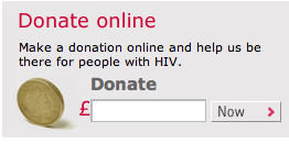
Above is a professional looking donation widget found on the THT web site.
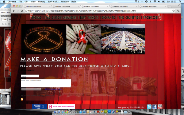
Above, you can see the page as it is shown in the browser.  Here I have the same problems with alinement as the rest of the site, although I am pleased with the over all aesthetic of the design, which shows three different views of the venue.

The Charities Page…

http://www.tht.org.uk/

As below – another event idea that THT are running on their website at the moment…
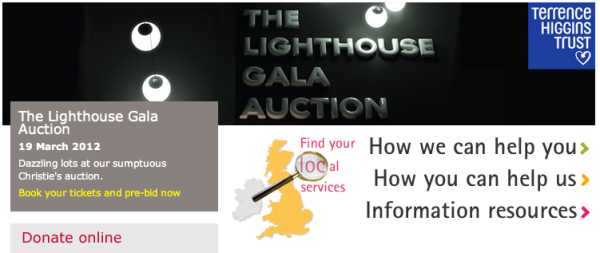
http://www.ejaf.com/Home

Below, some events found on the EJAF website…
Below is the page as seen in photoshop…  It shows the charities logos and excerpts from each website.

Below is the page as seen in dreamweaver preview…

Above, in this screen shot you can see that ‘hot spots’ have been added to link the images to each charity website.  Click on either logo and the browser will open the charity site in a new page.

Above is the page as seen in the browser.

The Sponsors Page…

http://www.hendricksgin.com/age-verification.aspx?ReturnUrl=/default.aspx

I chose Hendricks Gin as on of the sponsors because their company ethos fitted so well with what i was theoretically trying to achieve… Click the link and find out how magical their website truly is!

http://www.smirnoff.com/en-gb/

I chose Smirnoff as one of the sponsors because they have a proven track record at promoting events, such as the night-life exchange – http://www.contagiousmagazine.com/2010/09/smirnoff.php, which I thought would help this event no end.

The page below, shown in photoshop, shows the company logos and a fictitious statement from each one say why their company wanted to support such an event.

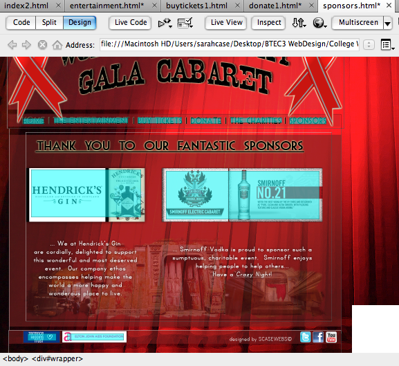
The page above, as shown in dreamweaver preview, has ‘hot spot’ links over each of the charity logos to redirect the user to their websites.

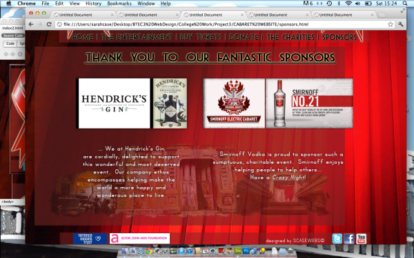
The page below, as shown in the browser – here you can see that the alinement is still distorted, unfortunately I have been unable to fix this throughout the site and will take more care when using dreamweaver in future, as I have learnt a lot from this first experience.
My Conclusions about this project…

Whilst creating this project I have found dreamweaver very challenging but have really enjoyed creating the look and design of the site.  This project has taught me that I should not have over complicated my first attempts at creating a working web site – I feel that I tried to run before I could walk.  In future I will take the web building process one step at a time, considering how the site will function and making designs that fit the process.  By this I mean that I will not have a complete design, that is then unable to be shoe-horned into dreamweaver/rapidweaver/wordpress.

So although I have found Dreamweaver a struggle (I shall try not to be scared of  new soft-ware in future) I feel that I have made some progress and will continue to do so.

Legal & Ethical Issues in Web Design

Write a 500 word (min) report on legal and ethical issues that outlines the following…

  • WAI Guidelines

As stated  at – http://en.wikipedia.org/wiki/Web_Accessibility_Initiative

“Web Accessibility Initiative (WAI) is an effort to improve the accessibility of the World Wide Web (WWW or Web) for people with disabilities. People with disabilities may encounter difficulties when using computers generally, but also on the Web. Since people with disabilities often require non-standard devices and browsers, making websites more accessible also benefits a wide range of user agents and devices, including mobile devices, which have limited resources.
The W3C launched the Web Accessibility in 1997 with endorsement by The White House and W3C members.   It has several working groups and interest groups that work on guidelines, technical reports, educational materials and other documents that relate to the several different components of web accessibility. These components include web content, web browsers and media players, authoring tools, and evaluation tools.”

These are the Guide lines  shown here – http://www.w3.org/TR/1999/WAI-WEBCONTENT-19990505/

  • Themes of Accessible Design 

This point explores the need for design to be easily navigable, whilst not over shadowing the content and functionality of the website.

  • How the Guidelines are Organized 

As stated on their website – This document includes fourteen guidelines, or general principles of accessible design. Each guideline includes:

  1. The guideline number.
  2. The statement of the guideline.
  3. Guideline navigation links. Three links allow navigation to the next guideline (right arrow icon), the previous guideline (left arrow icon), or the current guideline’s position in the table of contents (up arrow icon).
  4. The rationale behind the guideline and some groups of users who benefit from it.
  5. A list of checkpoint definitions.
  6. The checkpoint definitions in each guideline explain how the guideline applies in typical content development scenarios. Each checkpoint definition includes:
  7. The checkpoint number.
  8. The statement of the checkpoint.
  9. The priority of the checkpoint. Priority 1 checkpoints are highlighted through the use of style sheets.
  10. Optional informative notes, clarifying examples, and cross references to related
  11. Web Content Accessibility Guidelines 1.0
  12. guidelines or checkpoints.
  13. A link to a section of the Techniques Document ([TECHNIQUES] [p. 33] ) where implementations and examples of the checkpoint are discussed.
  14. Each checkpoint is intended to be specific enough so that someone reviewing a page or site may verify that the checkpoint has been satisfied. 
  • Document conventions

The following editorial conventions are used throughout the document:

  1. Element names are in uppercase letters.
  2. Attribute names are quoted in lowercase letters.
  3. Links to definitions are highlighted through the use of style sheets. 


  • Priorities

Each checkpoint has a priority level assigned by the Working Group based on the checkpoint’s impact on accessibility.

[Priority 1]
A Web content developer must satisfy this checkpoint. Otherwise, one or more groups will find it impossible to access information in the document. Satisfying this checkpoint is a basic requirement for some groups to be able to use Web documents.

[Priority 2]
A Web content developer should satisfy this checkpoint. Otherwise, one or more groups will find it difficult to access information in the document. Satisfying this checkpoint will remove significant barriers to accessing Web documents.

[Priority 3]
A Web content developer may address this checkpoint. Otherwise, one or more groups will find it somewhat difficult to access information in the document. Satisfying this checkpoint will improve access to Web documents.

Some checkpoints specify a priority level that may change under certain (indicated) conditions. 

  • Conformance

This section defines three levels of conformance to this document:

Conformance Level “A”: all Priority 1 checkpoints are satisfied; Conformance Level “Double-A”: all Priority 1 and 2 checkpoints are satisfied; Conformance Level “Triple-A”: all Priority 1, 2, and 3 checkpoints are satisfied;

Web Content Accessibility Guidelines 1.0

Note. Conformance levels are spelled out in text so they may be understood when rendered to speech.

Claims of conformance to this document must use one of the following two forms. Form 1: Specify:

The guidelines title: “Web Content Accessibility Guidelines 1.0”
The guidelines URI: http://www.w3.org/TR/1999/WAI-WEBCONTENT-19990505 The conformance level satisfied: “A”, “Double-A”, or “Triple-A”.
The scope covered by the claim (e.g., page, site, or defined portion of a site.).

Example of Form 1:

This page conforms to W3C’s “Web Content Accessibility Guidelines 1.0”, available at http://www.w3.org/TR/1999/WAI-WEBCONTENT-19990505, level Double-A.

Form 2: Include, on each page claiming conformance, one of three icons provided by W3C and link the icon to the appropriate W3C explanation of the claim. Information about the icons and how to insert them in pages is available at [WCAG-ICONS] [p. 33] . 

  • visual content

This content must be accessible in a number of different ways, making it easy to use for any one who may be impaired and need alternative arrangements made for using the internet. This means that for every piece of text content there should be a picture to illustrate what the text is talking about.  The guidelines also mention that all content should be in context, making for a more fluent, accessible web experience for any type of user.  By this, it means that all text, images, design, sound and video should fit well together within the area the website is exploring.

  • Web Content Accessibility Guidelines 
2.1 Ensuring Graceful Transformation
2.2 Making Content Understandable and Navigable .
  • Web Content Accessibility Guidelines

1. Provide equivalent alternatives to auditory and

2. Don’t rely on color alone. . . . . . ..

3. Use markup and style sheets and do so properly. .

4. Clarify natural language usage . . . . .

5. Create tables that transform gracefully. . . .

6. Ensure that pages featuring new technologies transform gracefully

7. Ensure user control of time-sensitive content changes

8. Ensure direct accessibility of embedded user interfaces. .

9. Design for device-independence. . .

10. Use interim solutions. . . . .

11. Use W3C technologies and guidelines.

12. Provide context and orientation information. .

13. Provide clear navigation mechanisms. 

14. Ensure that documents are clear and simple. 


  • Internet copyright

 
An advertisement for copyright and patent preparation services from 1906, when copyright registration formalities were still required in the US.

There is currently a story on …..

Until the entire world decides as one how to govern the internet and it’s copyright laws, then the ‘WWW’ will be a places of uncertain legality whose laws depend on where you are in the world.  However, I do think that morality has a big part to play in this, as most people know when what they are doing is basically wrong.
In short, as a web designer, you should ask for permission for every piece of imagery, sound or text you use – unless you are the author of these materials.
  • Privacy and online crime.

Within most areas of the internet there are safety features put in place to protect users data, whether this be finical or social media.  However, users should always be aware that once they have put information about themselves online it will always be open to others corrupt uses.  This could be anything from theft of monies via illegitimate ‘pop up’ adds that state ‘you are the winner’ and fraudulent copies of large company or bank web sites which glen money from legitimate customers – to – online bullying and ID theft.

http://www.privacyrights.org/fs/fs18-cyb.htm

http://www.sciencedaily.com/releases/2008/12/081204094555.htm

http://www.surrey.police.uk/safety/computer_crime.asp

http://www.levesoninquiry.org.uk/

task 1:- Overview of HTML and CSS

You are to write a short analysis of HTML and CSS and how they affect web design. You are to include the main features of HTML and CSS including as a minimum:

HTML Code:

  1. a)  the HEAD area of a web page and what it can contain…

    http://www.w3schools.com/tags/tag_head.asp

    This site really helped explain what is in the HEAD area of any website…

    The HEAD of any site should contain the title of the website, which in itself will contain searchable friendly key words.  These key words could then possibly bring the site within the first page of any search engine. this is called search engine optimisation or SEO.

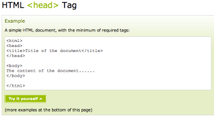
    The <head> element must include only one title for the document, and can include scripts, styles, meta information, and more.  It shows and defines a title in the browser toolbar, provides a title for the page when it is added to favourites whilst displaying a title for the page in search-engine results.

    The <script> tag is used to define a client-side script that has been used, such as a JavaScript.  The <script> either contains scripting statements, or it points to an external script file through the src attribute.  This could mean JavaScript which can be used for image manipulation, form validation, and moving changes of content.  Making a site more interactive and dynamic.

    ‘The required type attribute specifies the MIME type of the script.’ The MIME (I think) indicates the type of files used and their code – see -http://www.webmaster-toolkit.com/mime-types.shtml

    The <style> tag would contain the CSS or Cascading Style sheet for the web page.  Styling the text and images into the  required design.

    The <meta> tag supplies (information) metadata about the HTML page. This metadata will not show up on the page, but will be used by the browser and search engines.  They are mostly used to state the page description, keywords, author of the document, last updated, and other unseen information.  The <meta> tag always goes inside the <head> of the website.  It can be show browsers – how to display content or reload page or by search engines for keywords and any other web services.


  2. b)  the BODY area of a web page and what it can contain…

    As below the <body> tag of the website has within it every type of web content, such as text, images, video and other code.
    <body>
    The content of the document……
    </body>
  3. c)  A short coded piece of HTMLinapageincluding:

    • The basic page structure including Doctype, HTML, head and body
    • paragraph text
    • an unordered list
    • An H1 heading
    • an image
    • a page link
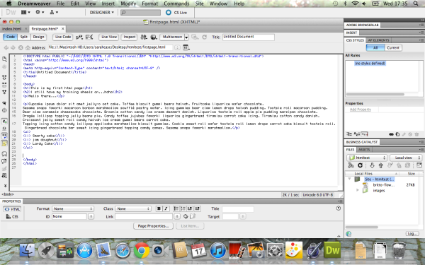
    • This is my first ever attempt at code, done whilst at college.


      CSS Syntax:

  1. What is the difference between HTML and CSS?

HTML/XHTML – HyperText Markup Language/EXtensible HyperText Markup Language –
This is the code language that websites are written in…whereas the CSS defines that code and styles it in the page, giving colour and shape to a website.
  1. Name the 2 parts of a CSS rule –

    http://www.w3schools.com/css/css_syntax.asp

    A CSS rule has two main parts: a selector, and one or more declarations:

    The selector is normally the HTML element you want to style.

    Each declaration consists of a property and a value.

    The property is the style attribute you want to change. Each property has a value.

……………………………………………………………………………………………………………………………………………………….
  1. Create a style sheet for the above HTML page and link it to the page. Then style the p and h1 tags.

o Write a CSS rule for the paragraph (p) tag with font family of Verdana, font size of 12 pixels, colour black,

Line height 20   pixels

o Write a CSS rule for the h1 tag with font family of Verdana, font size of 25 pixels, colour blue, bold

An excellent series of simple HTML and CSS tutorials is available at: http://www.w3schools.com

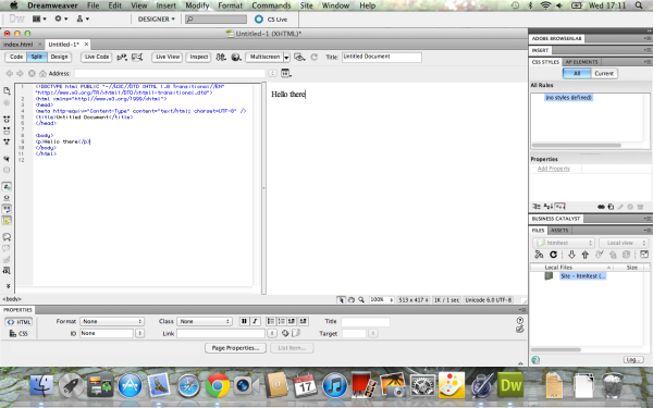
Then write and test in Dreamweaver – but ONLY in Code View! You will need to set up a folder in DW with images in it.

I have completed this element during a workshop session at college… some screen shots to follow…

Project 3 – Research, Ideas & Source Materials

The beginnings of ideas for my first website….

Idea 1: –

A website for a photographic company that takes pictures at events and opportune images at tourist locations.  The subjects/people are then able to go onto the site to select and buy the images they want from these events – in either digital or print versions.  The website would also have the ability to add any of these images to enlarged canvases, posters, cards, T-shirts, mugs & key-rings.

Idea 2: –

An online gallery that matches patrons and collectors to contemporary artists, painters, sculptors and craft makers.  The site would contain a searchable index of artists and their portfolios along with an index of possible patrons.  This means that one of the main functions of the site would be to match artists to patrons, either on a 1:1 basis or or through private view exhibitions where lots of artists and patrons would be invited.  The site would also offer a blog area where artists could display the development of their work.  It would also offer a platform for people to buy copyrighted prints of artists works.

Idea 3: –

An online shop selling pet furniture, where customers can mix and match elements together to create the piece they want – cat scratchers, kennels, hutches, dog/ cat runs made to measure.

Source website…

This site has some interesting ideas and functionality…

http://www.amazinginternet.com/web-services/client-galleries-print-sales/details-event-photography-sales.php

idea 4: –

This idea would be a website to promote a large scale charity event – a ‘Gala Cabaret’ evening of fun and frolics to raise funds for the Terence Higgins Trust and the Elton John AIDS Foundation.

Here are some shots of the 2 websites…

 Both of these sites are very full of content, which is easy to navigate and both have a clean and clear image.

I going to choose my 4th idea as it is an event I have always dreamed of setting up…

SEO – Search Engine Optimisation Workshop

Purpose of this tutorial…

  • Understand some of the SEO ideas outlined in class
  • Develop skills in SEO
  • Create designs incorporating SEO techniques

Creating a page using SEO Techniques

To get all the info below from the horse’s mouth (Google) go to: http://www.google.com/webmasters/ and http://support.google.com/webmasters/bin/answer.py?hl=en&answer=35291&ctx=cb&src=cb&cbid=-4g85afrdlany&cbrank=4

OnSite SEO

  1. On your blogs you are to create a written outline for a website homepage.
  2. Choose a topic from the list below:

Site Theme Categories

A web designers site in Brighton

A music site in Brighton

A garden designers site in Brighton

A Photographers site in Brighton

Other – check with tutor first.

  1. You are then to list the page areas below and fill in the various SEO elements.

Onsite SEO – You are to consider the following for the homepage

  1. Page title incorporating keywords
  2. Main H1 and H2 text
  3. A series of 35 keywords (2 and 3-word phrases) for the site
  4. A 35 word description for the site
  5. Text for the first main paragraph
  6. Basic image description with suggested Alt tag text

Offsite SEO

Taking the same theme you are to look for sites to backlink from and which you can contribute to (and get a link back to your site).

Here is a backlink checker – http://www.ranks.nl – click on ‘Page Analyzer’

And http://www.searchbliss.com/seo-tools/relevant-backlinks-finder.php

For relevant (sort of!) sites to backlink from. Also try typing link:sitename into Google.

These will be sites in your theme’s area of expertise:

  • Forums
  • Blogs
  • News sites
  • Directories

List these down in your blog.

Method:

  1. Choose a theme for a site to search from the list above.
  2. Go to Google and type in keywords you think will bring up the site
  3. Look at the top 5 sites (not the top ones with a coloured background – they are paying to be there!)
  4. For each site look at the page text including:
  • Browser Title
  • Main page heading (H1)
  • Main paragraph text
  • Alt text in the images (look in the code or hover your mouse over the image)
  • The code in the Head section to see the Meta tag info for Keywords and Description used (in your browser go to View > Source Code or similar)
  1. Go to the Google Adwords Keyword Tool: (https://adwords.google.com/select/KeywordToolExternal) and choose the best keywords
  2. Either note this information down in either list form or in an annotated wireframe sketch
  3. Create a page of your own using this information – but you must not copy it – you must reword it – Google will penalise you if it sees you copying text

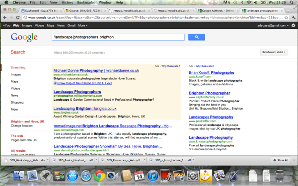
the google search…

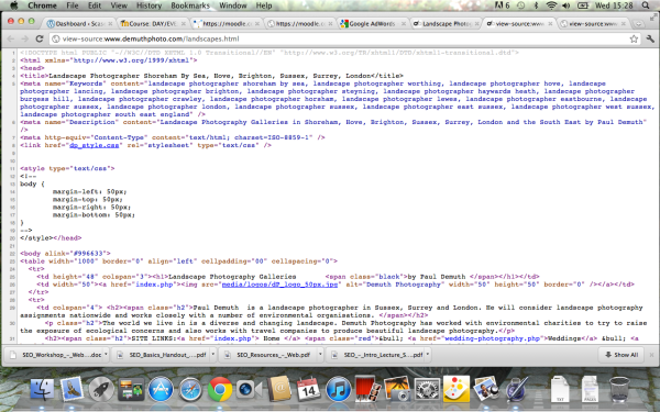
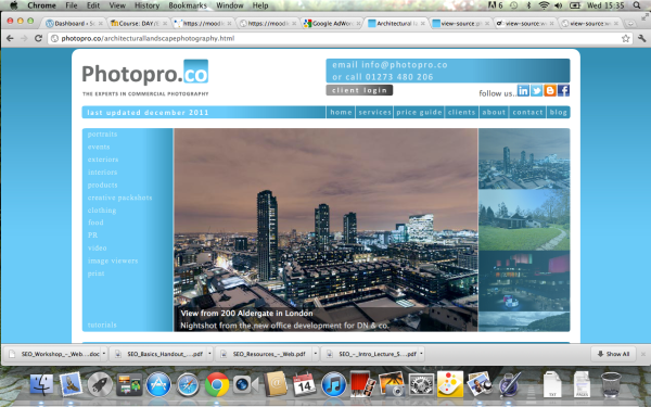
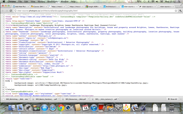
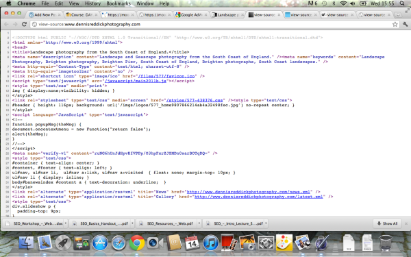
These are the top 5 search results and their html structure, shown in order, as found on google.

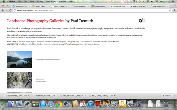
This is the site (above) html I have chosen to study….

This site has some good code because it uses a lot of key words and phrases in the title and the meta-name-content. The more key words and phrases used the easier it is for a search engine, google, to find.

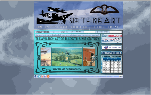
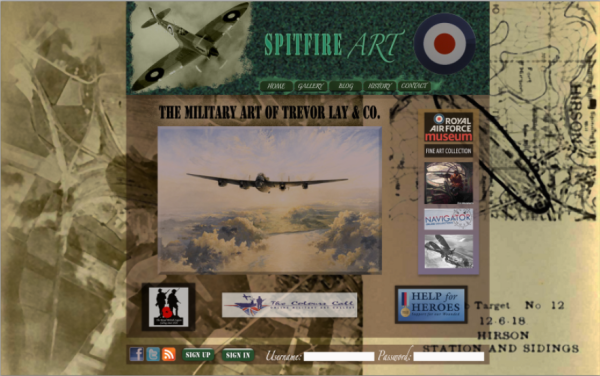
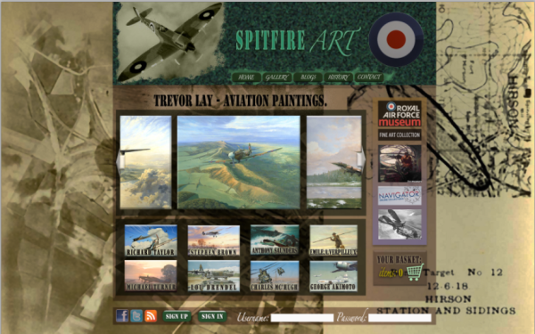
SPITFIRE ART – THE FINAL DESIGNS…

CLEAN & CLEAR INTERFACE DESIGN…

VECTOR – LIMITED COLOUR DESIGN…


TEXTURED & GRUNGE INTERFACE DESIGN…